
Once you’ve accessed a patient’s episode, you can select the Charts tab to reveal a graphical representation of the patient’s adherence with their PTIH home exercise programs. These charts are built in real time and are also available to the patient in the In Hand Health Patient App.
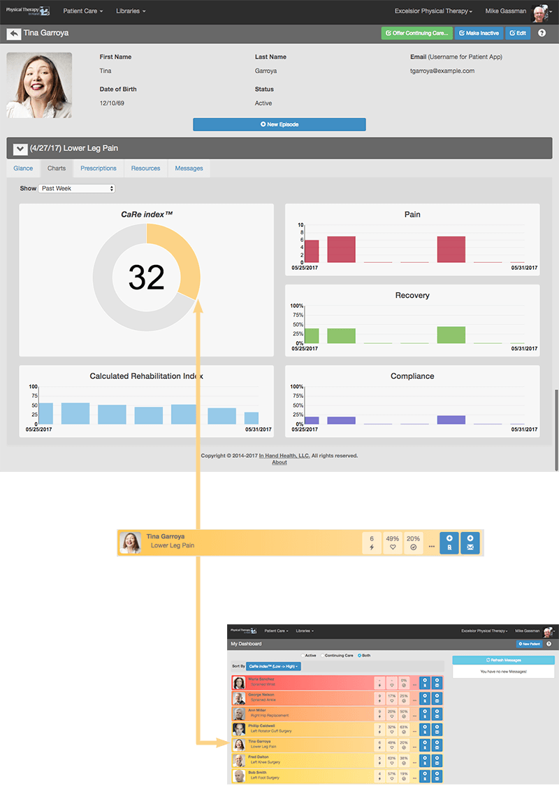
Here are brief descriptions of the data sets that are used to build each chart.
Pain Chart: Patients are asked in the In Hand Health Patient App to rate their pain level before and after exercising.
Recovery Chart: Patients are asked in the In Hand Health Patient App to rate their degree of recovery at the end of exercising.
Compliance Chart: PTIH communicates with the In Hand Health Patient App to determine if a patient exercises the prescribed times per day and how much of the workout they finished when they do. If you enabled the patient to log workouts done without the app's guidance, PTIH checks for that action.
CaRe Index™: In Hand Health’s CaRe Index™ combines data from the first three measurables to present a real-time composite score of the patient’s progress. Lower reported pain levels and higher recovery levels and exercise compliance rates yield higher CaRe Index™ scores.
A CaRe Index™ score determines the colors used on the CaRe Index™ chart and the Patient Dashboard. Reds and oranges indicate low CaRe Index™ scores and patients who might need attention. Yellows and greens indicate patients with higher CaRe Index™ scores and likely in better compliance with their plans.